
The MJog design approach: the evolution of Desktop GP
Published by Karen Percy on
Jul 30, 2021 5:25:14 PM
Last month, I introduced you to the Livi and MJog user centred design principles and how we are applying them to the services we’re creating for you and your practices. I mentioned that a big change project for us is the reinvigoration of our patient messaging toolbar, Desktop GP.
Designing a toolbar that meets patient and doctor expectations
The majority of patients in the UK will have had contact with their GP via a patient messaging platform in the last 18 months. Digital messaging contact and teleconsultation is a true primary care enabler. Some of our customer practices are reporting incredible stats - one practice in Scotland has reduced its appointment request time from 2-3 weeks to 48 hours.
To be able to continue, post-pandemic, to offer a messaging service that satisfies both practice and patient cohort, we need to make sure that Desktop GP helps doctors provide even better healthcare, and a pathway to support continuous improvement of service.
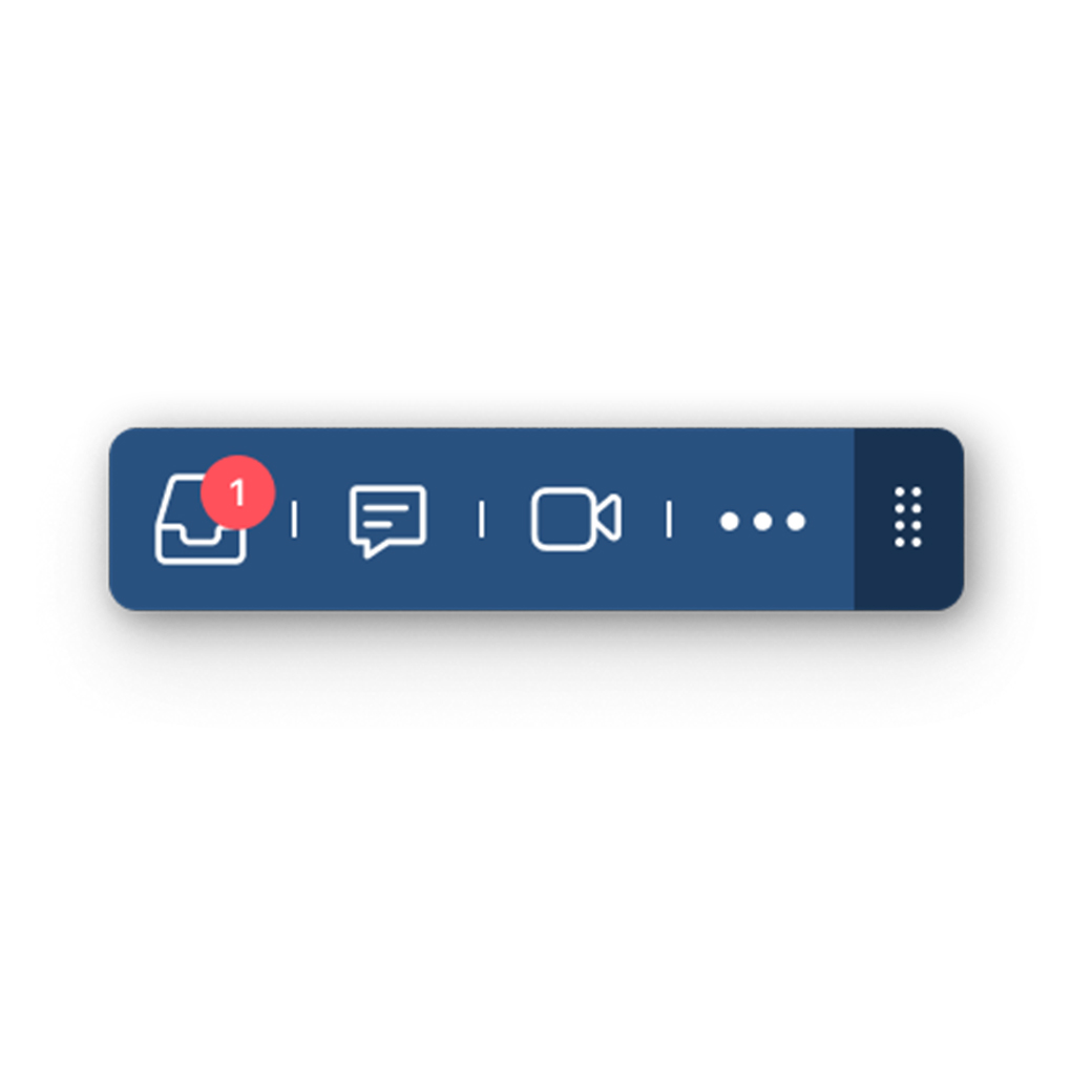
From onboarding to everyday usage
The redesign of Desktop GP has been an iterative, two-stage process. At the start of 2021, the service didn’t meet our customers’ growing requirements, and needed an immediate update to bring its skillset forward. We began a process of designing both an upgrade, and a design refresh, to run concurrently. Our goal was to design a service that was useful, simple and delivered outcomes from the first GP onboarding through to instinctive everyday ‘first choice’ use.
Flagship finesse to our design improvements
Feedback from customers was that although Desktop GP was ‘there’ on the desktop, doctors weren’t looking at it. Navigation was a key concern. It needed to be better integrated with other tools, and, crucially, work in tandem with the practice EMR. In general, multiple desktop windows are an irritation to the already busy GP, so our goal was to minimise these. We also understood that, when it comes to sending a patient message, if you are counting the clicks in frustration as you perform the task, our service isn’t working, so we designed the refresh to be as minimalistic as possible.
We worked with our Flagship practices to finesse our designs for the refreshed service, asking for feedback at every turn. They tested prototypes, and took part in one on one moderated user testing. They helped our deep understanding of what they needed Desktop GP to do and how they wanted to communicate. They suggested new requirements and functionality, such as the ability to code a message to record, and the ability to add a fit note to the capability. As well as needing the ability to request a reply, our Flagships helped us develop the disabling of replies where appropriate.
Together, we made Desktop GP look and feel simpler. In the two dozen interviews I undertook during the process, the most used description of the previous service was ‘clunky’. After our design refresh, we are hearing things like, “now it looks like it’d be faster!’
Our plans for further design improvements
We released news about the go-live of the latest updates here, and the upgraded design Desktop GP is available to most of our customers. A selection of Flagship practices is testing some new features which we hope will be rolled out over the coming weeks. We’d love to hear what you think of the improvements we’ve already made, and if you’d like to join our Flagship team and get early access to new features and have the chance to shape Desktop GP further, please get in touch.
Tags:
Desktop GP